This title sequence uses typography for it's illustration. Text off the pages—in the title sequence, form shapes and moving imagery to create a creative introduction to the show.
 |
| Tom Barham, Curious Pictures, Opening title sequence for Bored to Death, 2009 |
The font used in the title sequence is a basic serif font. This font is typically used for newspapers, books and other printed material. Using a serif font for this title sequence creates a "writer/reader" feel to it, which adds believability that this is a real book being used in the sequence. Serif, rather then sans-serif, is also easier to read and presents a more professional/sophisticated look.
The typography used in this title sequence reflects the themes & ideas for the show. With it's black and white layout, the target demographic is clearly one who likes both comic books & mystery. Although, with it's 'sophisticated' feeling and song, it implies an older [comic book/newspaper reading] audience.
To learn more about how the title sequence was created click here.
As many people know, my favourite television show
is Dexter. I think the overall show is
simply amazing. However, I’ve always been iffy about the shows advertisements. I can never decide if the typography and
overall design is doing too little, or just the right amount. So, it is now
time to decide. Firstly, here is a Dexter advertisement:
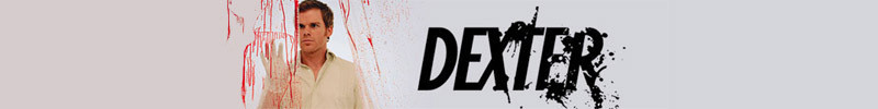
I started by figuring out which typeface is used
in the Dexter adverts. I have recently discovered that I am awful at simply
looking at a text and knowing what it is. For example, I thought Dexter’s font
was maybe Helvetica bolded and even italicized. But after staring at the
advertisement, I realized that this was not the case. Whereas in the initial
picture posted above, the T’s little top flicker looks like part of the blood
splatter, in this advert (posted below) I realized it was part of the text. So
I went to google to learn more. After
typing something really silly, along the lines of ‘Dexter font theme title’
into google, I found a few forums where hardcore Dex fans discovered that the
Dexter typeface is called Soda Pop.

Now that I knew the font, I looked more closely
at the advertising and decided it was really well done. The sans serif font
starts off very simply. It’s just clear font. And as the title continues, blood
sprouts out of it. This simple idea tells Dexter’s story—He is a simple man by
day, but at night he kills. The plain text represents Dexter’s “real” life
& the blood splatter represents his dark passenger. Its simplicity also suggests an older targey audience.
One who doesn’t need separate colours or a fancy typeface to understand what
Dexter is all about.
Toys R Us


 The pastel colours of the logo work extremely
well too. When one thinks of children, or even toys, their mind—or at least my
mind automatically goes to two things: pastels & the rainbow. I think that
Toys R Us has used colours that reflect their target audience and products.
Note that the colours are not either pink and girlie or blue and boy-like as
people usually associate with babies, but rather pastel, darker, truer colours
that toddlers & older children are associated with.
The pastel colours of the logo work extremely
well too. When one thinks of children, or even toys, their mind—or at least my
mind automatically goes to two things: pastels & the rainbow. I think that
Toys R Us has used colours that reflect their target audience and products.
Note that the colours are not either pink and girlie or blue and boy-like as
people usually associate with babies, but rather pastel, darker, truer colours
that toddlers & older children are associated with.

Toys R Us
The Toys R Us logo has always made me feel happy!
It’s big and colourful and loud. I think that the company has done an amazing
job at capturing their entire essence and target audience. The letters are
bright and happy much like little children. Little children are drawn to the
store because of their branding. Children like big playful letters similar to
the ones used in this logo. If instead they had used a typeface such as Ariel
or Helvetica, it would not have the same effect.
The font used for this logo is
called Toy Box—With the manually reversed R.

 The pastel colours of the logo work extremely
well too. When one thinks of children, or even toys, their mind—or at least my
mind automatically goes to two things: pastels & the rainbow. I think that
Toys R Us has used colours that reflect their target audience and products.
Note that the colours are not either pink and girlie or blue and boy-like as
people usually associate with babies, but rather pastel, darker, truer colours
that toddlers & older children are associated with.
The pastel colours of the logo work extremely
well too. When one thinks of children, or even toys, their mind—or at least my
mind automatically goes to two things: pastels & the rainbow. I think that
Toys R Us has used colours that reflect their target audience and products.
Note that the colours are not either pink and girlie or blue and boy-like as
people usually associate with babies, but rather pastel, darker, truer colours
that toddlers & older children are associated with.
In conclusion, Toys R Us really knows who their
target audience is for the products they are selling & their logo proves
this.

If like me, you did not realize that their logo
changed—from having a reversed R in quotation marks to instead a reversed R
with a star in the middle, don’t fret. Read this article I found online to
learn more about the change!
*Please note that none of the above images are mine. I do not claim the rights to any of them. They are simply images I found online and believed worked well as examples
*Please note that none of the above images are mine. I do not claim the rights to any of them. They are simply images I found online and believed worked well as examples
No comments:
Post a Comment